

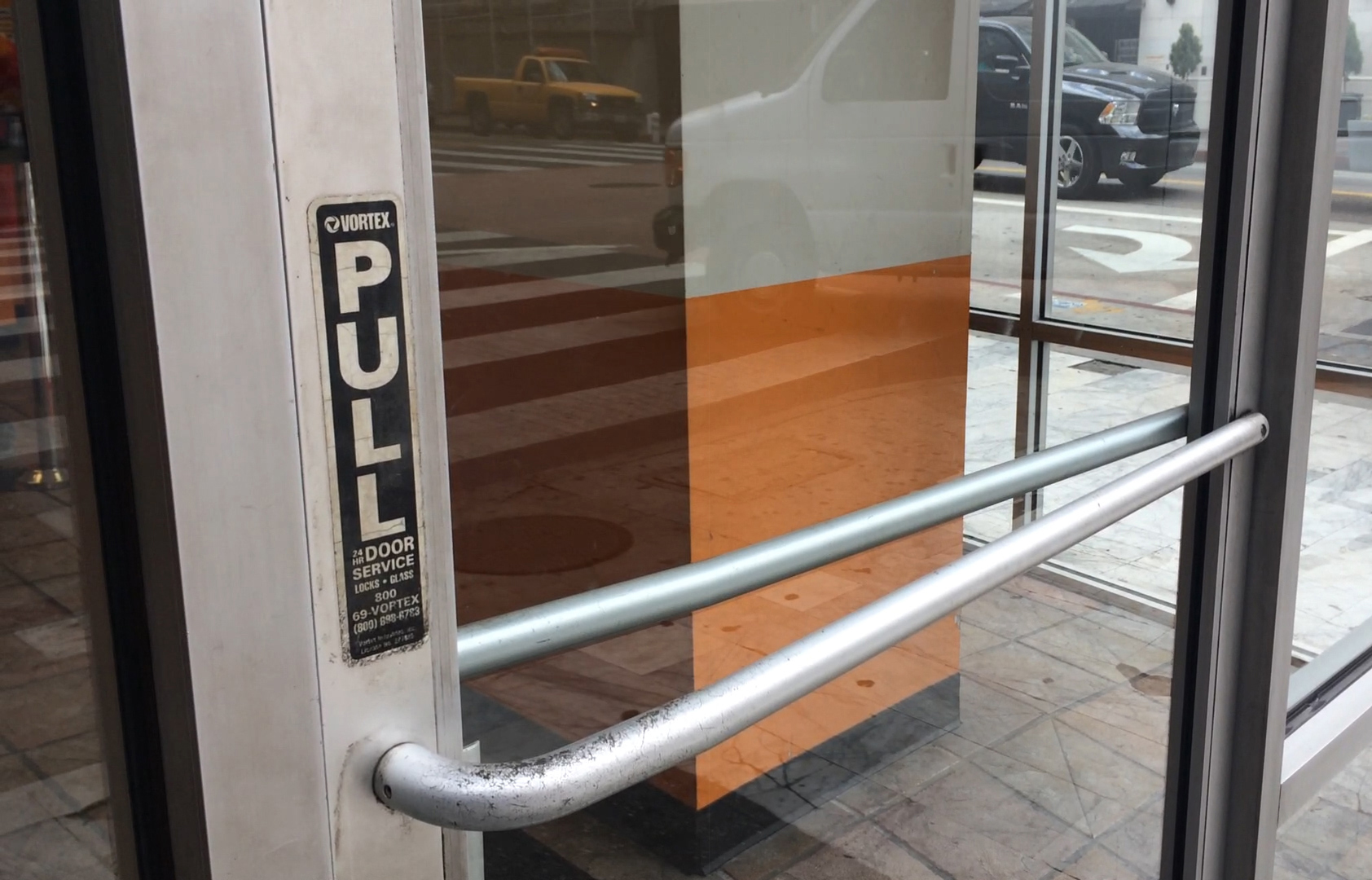
Have you ever approached a door, grabbed the handle, pushed it, and realised you were supposed to pull? Or perhaps the other way around?
“Good design is actually a lot harder to notice than poor design, in part because good designs fit our needs so well that the design is invisible.”
– Don Norman, The Design of Everyday Things
That everyday moment of hesitation has a name: a Norman Door.
Inspired by Don Norman, author of The Design of Everyday Things, the term describes objects that communicate the wrong way to use them. A door with a handle that suggests pushing when it actually needs pulling is a classic example. It sounds like a small inconvenience, but it reveals something much bigger about the relationship between design and people.
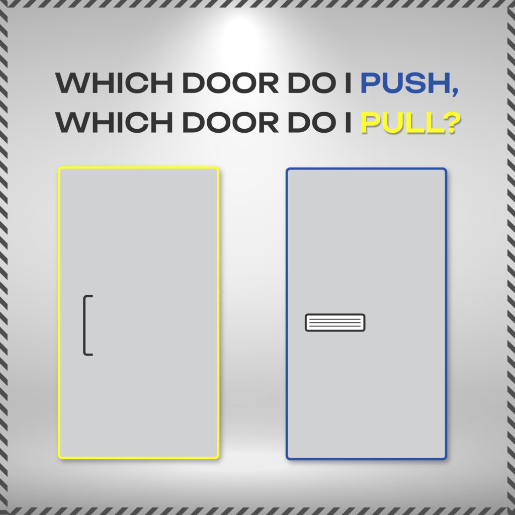
When people struggle to understand how something works, our first instinct is often to think they aren’t paying attention. But good design shouldn’t require people to stop, think, guess, or read instructions just to complete a simple action. A well-designed object communicates its purpose through its appearance and behaviour. Its form, structure, and visual cues should naturally guide people toward the right action.
This principle goes far beyond doors. We encounter it every day in websites, mobile applications, digital products, and even the smallest interface elements.
A button that doesn’t look clickable, a confusing navigation menu, an unclear icon, or a form that leaves users wondering what to do next — these are all examples of the same design problem.
In web and UI/UX design, the same principle is often described through affordances and signifiers.
Affordances define the possible actions an element allows, while signifiers communicate where and how those actions can happen.
For example:
Buttons should look like buttons and communicate that they can be clicked.
Navigation should be clear and predictable.
Links should be visually distinguishable from regular text.
Forms should guide users through each step without unnecessary friction.
Interactive elements should provide clear feedback when users engage with them.
Every interaction is an opportunity to make the experience easier — or more frustrating.
The best designs are often the ones people barely notice. They simply work. Users know where to go, what to do, and what to expect without having to figure things out along the way.
Whether it’s a physical door or a digital experience, the principle remains the same:
Don’t make people adapt to confusing design. Make the design work for people.

And that’s exactly why I think good UX is often invisible. When everything works as expected, you don’t even notice the design behind it.

Kawsar
May 18, 2025 | 9:22 amThis is such a simple example, but it perfectly illustrates how much thought goes into good design. We often blame ourselves for not understanding something, when the real issue is how it was designed in the first place.